Finding an Optimal Value
Remember that there isn't one correct value for . Instead, our goal is to optimize our value such that the KNN model performs effectively on the task at hand.
Our motivation for finding an optimal value is that if is too small, it will be too susceptible to outliers (as seen in Section 3.1). A larger value of usually works well, but one that's too large can be influenced by how many data points each label has. We can visualize this phenomenon below, where corresponds to the inner circle and corresponds to the outer circle.
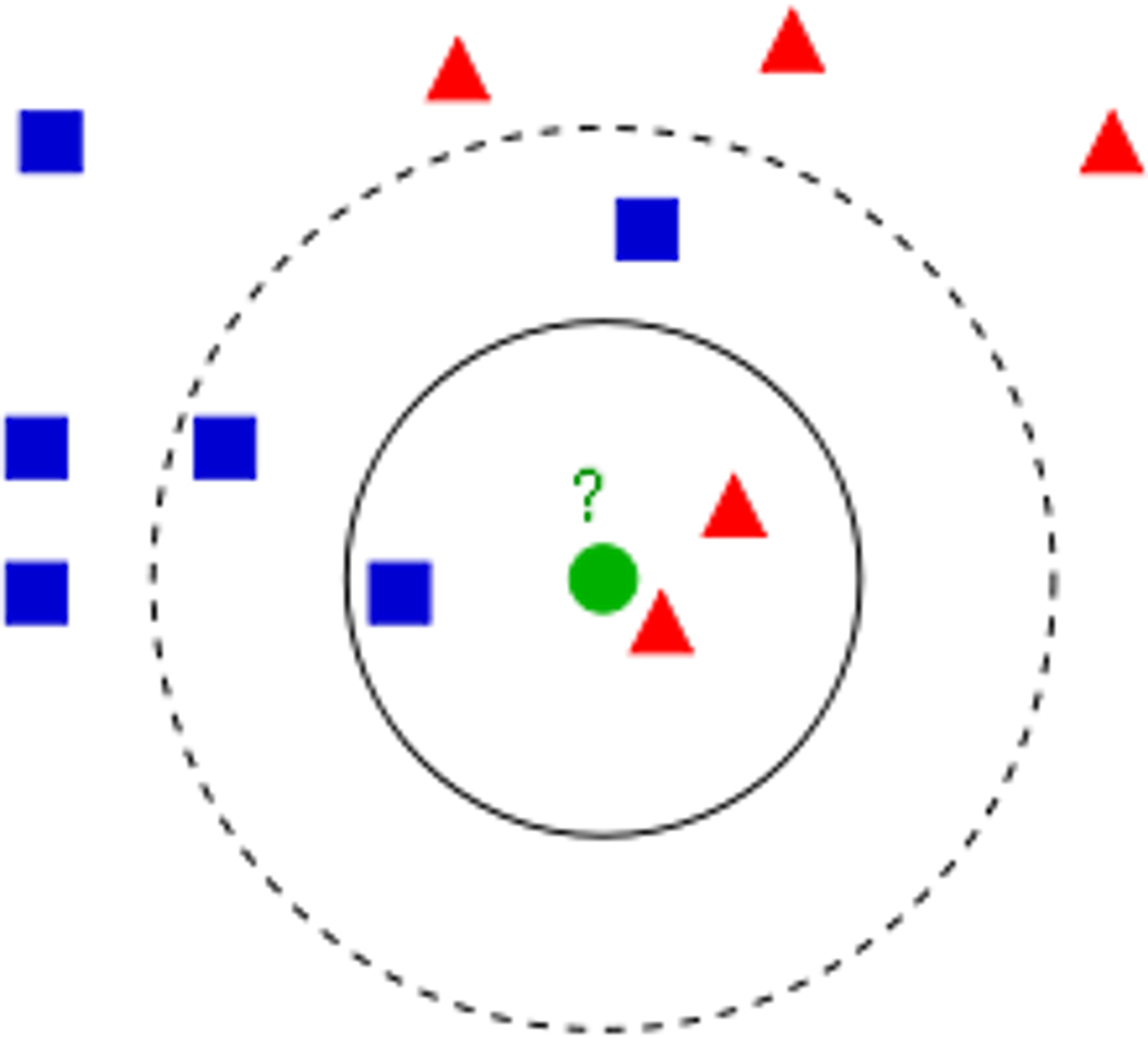
Intuitively, it seems like the correct label for the new data point should be red. A KNN model with would correctly classify this new data point as red because two of its three closest neighbors are red while only one of its closest neighbors are blue. However, a KNN model with would instead classify the new data point as blue because the next two closest neighbors are blue. Here, we can see that our KNN model was influenced by the fact that there are generally more blue points in the vicinity of our new data point, even though the new data point was closer to the area with red points.
Thus, we have a motivation to find a value of such that the KNN model isn't too susceptible to outliers and that it doesn't get influenced by the amount of data points each label has. An effective method to find an optimal value of is the elbow method, where we try all values of from 1-40. For each value of , we will train a KNN model on the train set, create predictions on the test set, and store its error rate . Then, we can use Matplotlib to plot a graph of error rate vs. value.
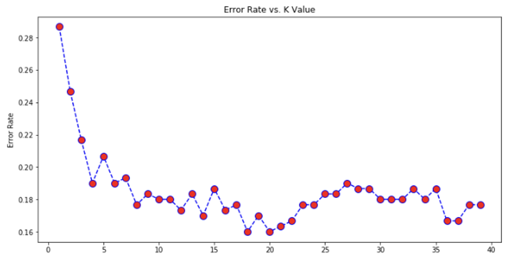
Notice how our graph resembles an elbow, where there is initially a steep decline in the error rate, which then quickly begins to level off. We want to choose a value right before the error rate begins leveling off and fluctuating. In this example, a great choice would be 7. Make sure to not just choose a value that produces the lowest error rate despite being located in an area that fluctuates a ton, because that will likely cause overfitting.
Distance Metrics
All of the data we've been dealing with so far only have two features, thus we were able to just plot them all on a graph and visually find nearest neighbors. To find the distance between two data points and , we can just use the distance formula we learned in school:
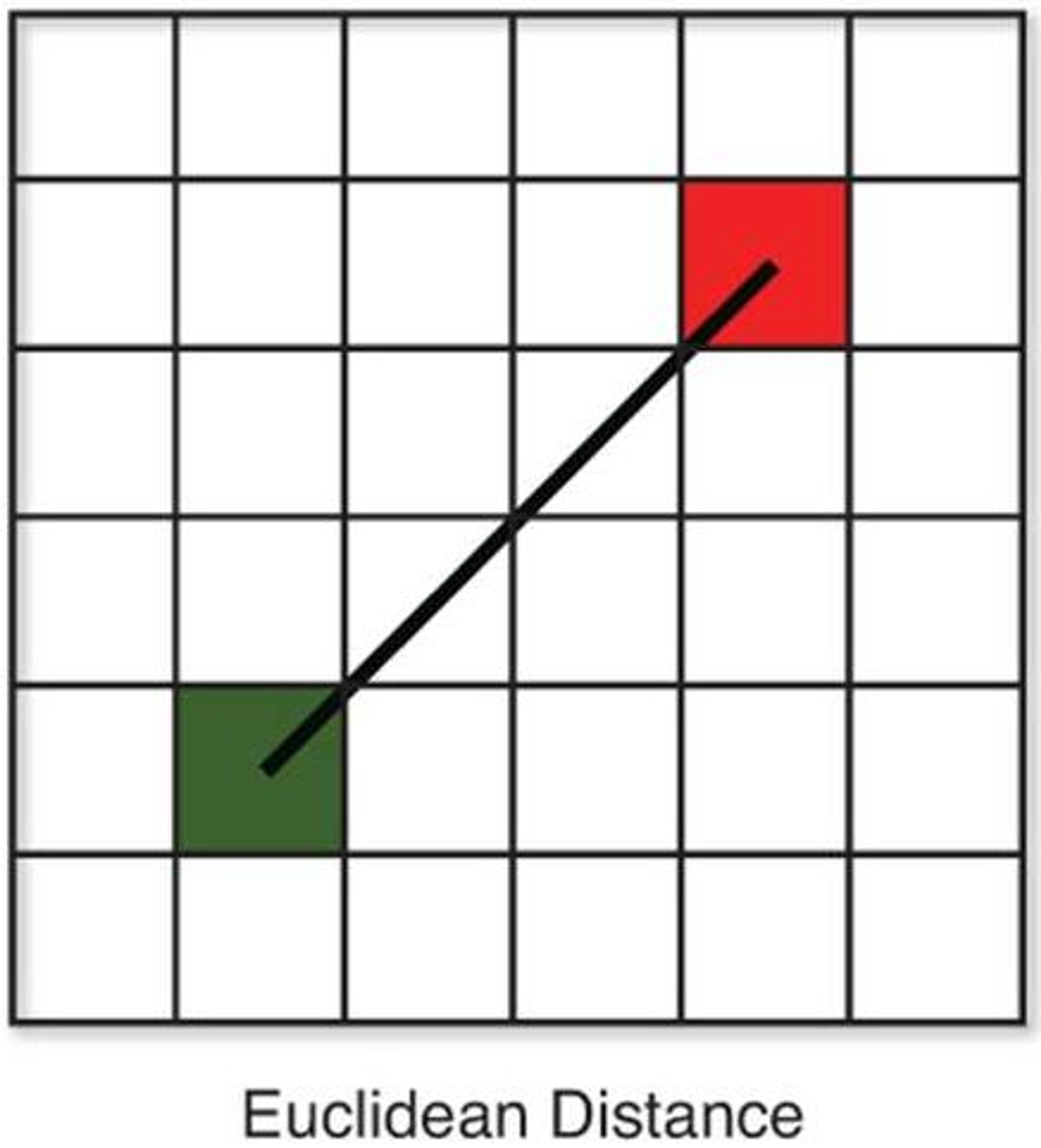
But how can we do the same with higher dimensional data that we can't visualize? The most popular distance metric is Euclidian distance, which is just an extension of the distance formula for 2D points.
The only difference between the Euclidian distance function and the 2D distance function is that with Euclidian distance, there can be dimensions. Thus, for each dimension (or feature), we do the same as we would with the 2D distance function - find the difference between the values of the two points for that feature and square it. Finally, we take the square root of the sum of all the values we get.
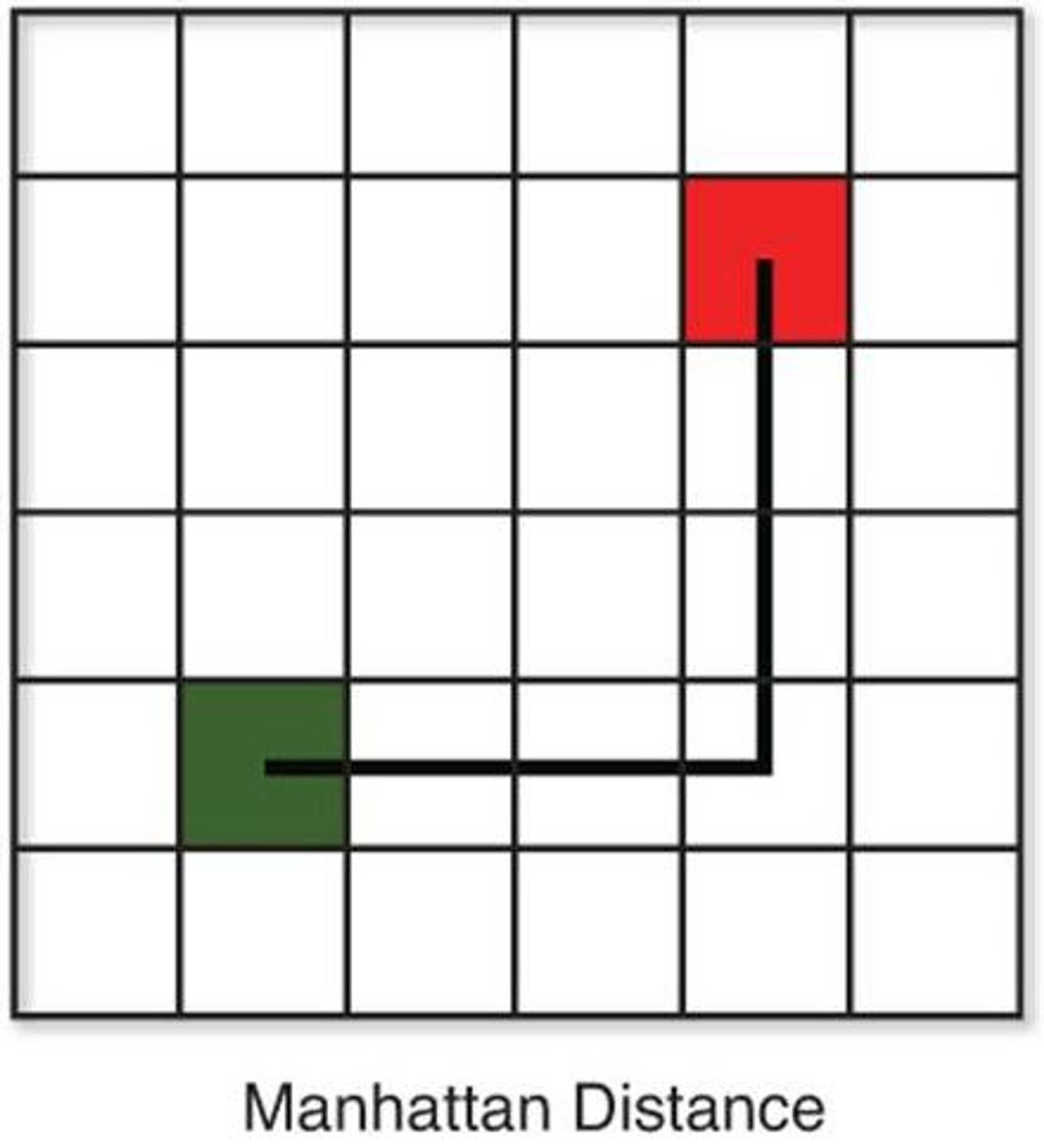
Another popular distance metric is Manhattan distance, which simply takes the absolute differences between the values of the two points for each feature and sums them up:
Here is a side by side comparison of the 2D version of each distance function:
Other distance metrics include Mincowski distance, Cosine similarity, Jaccard index, and Hamming distance, however these are more complex and are not in the scope of this course. In most cases, Euclidian distance is the best for KNN. But for very high dimensional data (or data with many features), Manhattan distance actually performs better.
If you don't know which distance formula to use, the best method is to just create a KNN model for each one and see what performs best!
Data Normalization
KNN relies on distance to perform calculations, and as such is affected by the scale of variables. Let's say we're trying to build a KNN model such that given how many children a person has and their yearly income, it will predict the size of their house (in square feet). Notice the difference in scale for our two features. The number of children a person has normally ranges from 1-4 whereas yearly income could range from less than $10,000 to more than $1,000,000. As a result, the "distance" between two data points will be impacted much more by differences in yearly income rather than the amount of children a person has. For example, even if there isn't a substantial difference between an income of $70,000 and $80,000, KNN will be impacted a lot more by this variation compared to a person having 4 children instead of just 1. Here is a visual depiction of this phenomenon (with different features):
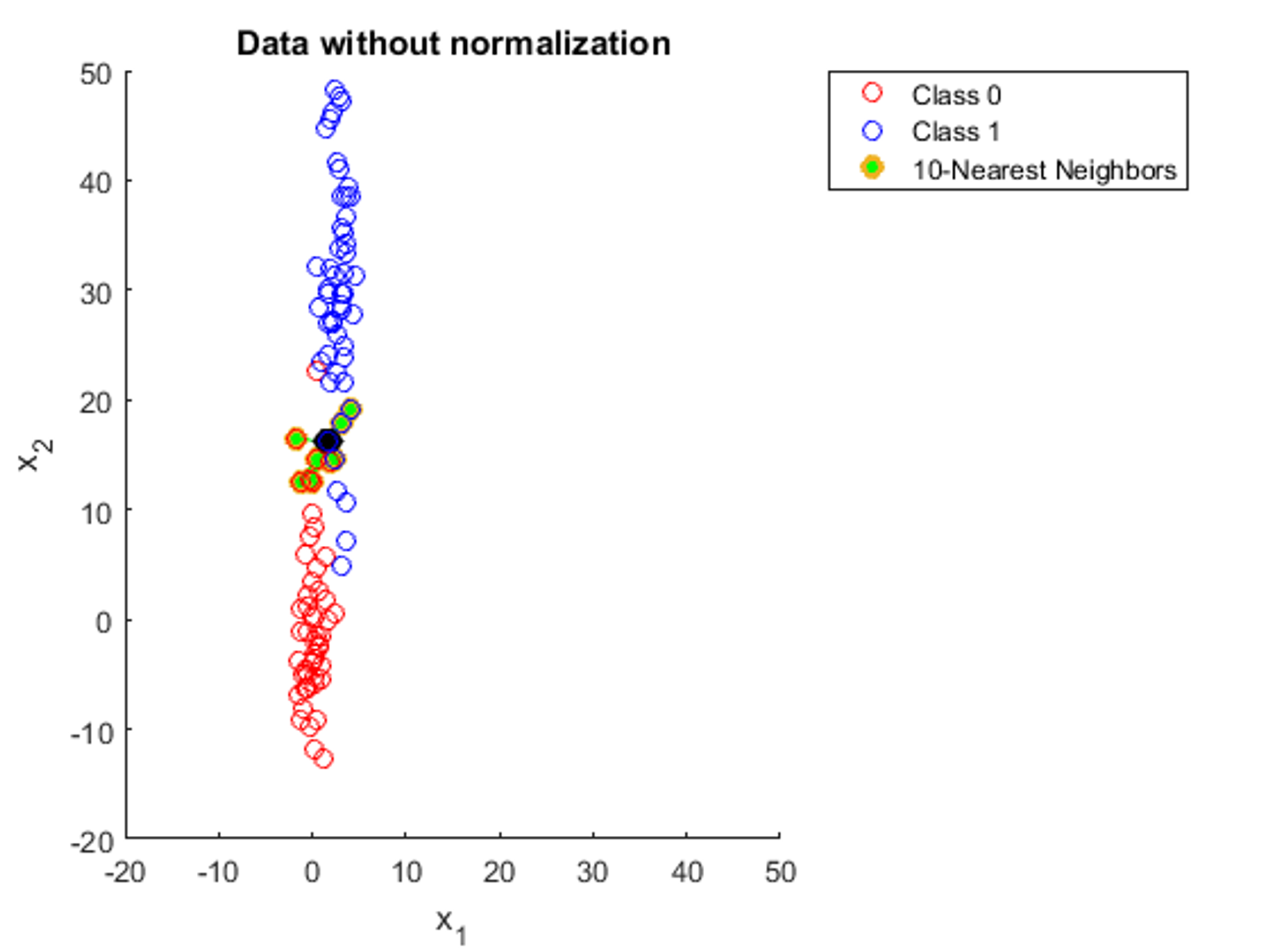
This is why we need to normalize our data, or bring all features to the same scale. This is what the same data from the image would look like if it was normalized:
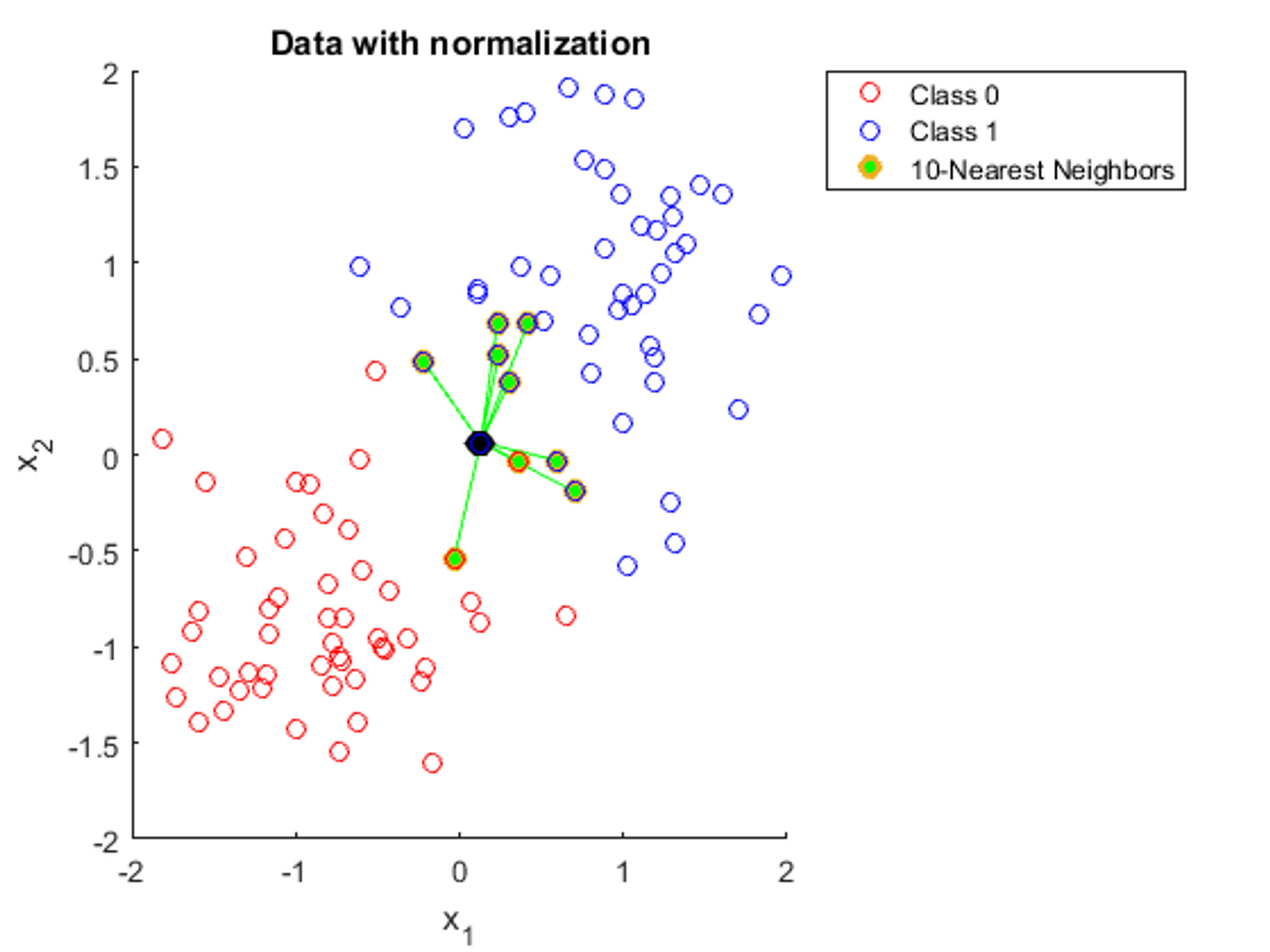
Here, we can see that with data normalization, all the features have an equal impact on the distance between two data points, which is exactly what we want. A common technique for normalization is through calculating the mean and standard deviation of each feature. Then, for each data point, we subtract the mean and divide by the standard deviation of that feature:
This way, all features will be centralized around 0 and generally range from approximately to (although this could be broader due to outliers).
Copyright © 2021 Code 4 Tomorrow. All rights reserved.
The code in this course is licensed under the MIT License.
If you would like to use content from any of our courses, you must obtain our explicit written permission and provide credit. Please contact classes@code4tomorrow.org for inquiries.