Calculator Grid
As a reminder, the CSS code is what gives our code a sense of “flare”. CSS provides the color, shape, layout, font, and more.
First, let’s style the background by selecting the body element:
body {
  padding: 0;
  margin: 0;
  background: linear-gradient(to right, #13547a, #80d0c7);
}
Then, let’s add the CSS for the calculator grid:
.calculator-grid {
  display: grid;
  justify-content: center;
  align-content: center;
  min-height: 100vh;
  grid-template-columns: repeat(4, 100px);
  grid-template-rows: minmax(120px, auto) repeat(5, 100px);
}
We set the display property to grid (so our calculator will be displayed in a grid). We also want our calculator to be center aligned. We’ll set the justify-content property to be “center” to center-align our grid in the horizontal direction; and we set the align-content property to “center” to center-align in the vertical direction. We also set the min-height property to “100vh” so that the initial height of the calculator grid is equal to the height of the viewport. Essentially, “100vh” means 100% of the height of your window (likewise,
“80vh” = 80%).
After, we need to set the number of columns and rows in our grid. To style our columns, use the grid-template-columns property (line 6). “Repeat (4, 100px)” tells our css file to create 4 columns, each one 100 pixels wide. To style our rows, use the grid-template-rows property (line 7). Our first row contains our input/output screen, so we want it to change size to accommodate more text if necessary. Then, we can use the minmax() function to set a range on the height of the first row. 120 pixels is the minimum height. “Auto” signifies that our row can expand as large as needed to accommodate all the input/output. Then, we create four more rows, each of height 100 pixels, with the repeat function.
Calculator Buttons
Let’s handle the calculator buttons now.
We need to first select the buttons in the calculator grid:
.calculator-grid > button {}
Since the buttons are inside the calculator grid (in our HTML document), we say that the buttons are child elements of the calculator grid. The “>” operator signifies that we are selecting a child element.
Now, let’s add the code to style our buttons:
.calculator-grid > button {
  cursor: pointer;
  font-size: 2rem;
  border: 1px solid white;
  outline: none;
  background-color: rgba(255, 255, 255, .75);
}
Additionally, let’s change the background color when we hover over the buttons:
.calculator-grid > button:hover {
  background-color: rgba(255, 255, 255, .9);
}
Output Screen
Firstly, we want the output to take up the entire width of our calculator grid.
.output {
  grid-column: 1 / -1;
}
This tells the browser that our output grid should span from the first column of our calculator to the last column (“-1” means the last column).
Next, we need to align the items in the output box. We’ll use flex display:
display: flex;
This will set our output box to a flex container so we can use flex properties.
We set “align-items” to “flex-end” to right-justify the content:
align-items: flex-end;
We set “justify-content” to “space-around” so that the output items have some space between them:
justify-content: space-around;
Also, we want our input/output items aligned vertically, so we set flex-direction to “column”:
flex-direction: column;
Then, use word-wrap and word-break to prevent overflow:
word-wrap: break-word; /* Allows long words to break and overflow to next line */
word-break: break-all; /* Allows words to break at any character */
After putting everything together, the CSS of our output box is:
.output {
  grid-column: 1 / -1;
  background-color: rgba(0, 0, 0, .75); /* black background, 75% transparency */
  display: flex;
  align-items: flex-end;
  justify-content: space-around;
  flex-direction: column;
  padding: 10px; /* add some padding */
  word-wrap: break-word;
  word-break: break-all;
}
Now that we’re done with the styling of the general output screen, let’s style the colors and font sizes of the two operand sections:
.output .previous-operand {
  color: rgba(255, 255, 255, .75);
  font-size: 1.5rem;
}

.output .current-operand {
  color: white;
  font-size: 2.5rem;
}
Lastly, recall the code for our AC-button and Equals-button:
<button data-all-clear class="span-two">AC</button>
<button data-equals class="span-two">=</button>
We gave both of them the css-class attribute span-two, because we want them to span two columns:
.span-two {
  grid-column: span 2;
}
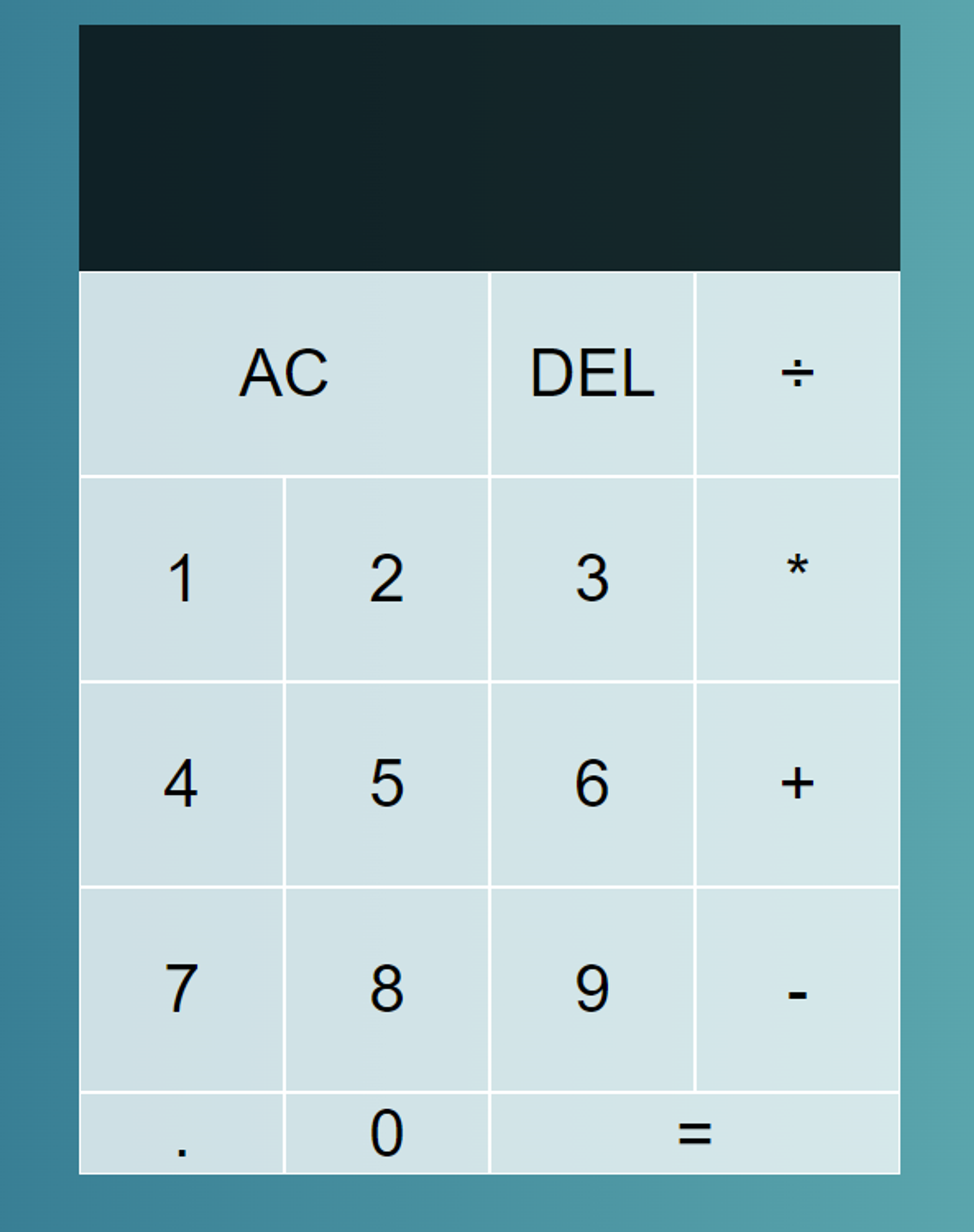
Now, we’ve completed the CSS for our calculator. The calculator should now look like this:
The link to the CSS code for the calculator is here: