import matplotlib.pyplot as plt
Matplotlib is our plotting/graphing library. We're going to import it as plt for short. In this lesson, we will discuss how to create a scatter plot using Matplotlib. A scatter plot plots the exact points from a list, but doesn't fit any curve/line/shape to it. Interpreting this kind of detailed visual will help us in Regression later, so let's get into it.
Let's say we have two equally-sized lists, attributeOne and attributeTwo. If we want to scatter plot one against the other, all we have to do is the following statement:
plt.scatter(attricbuteOne, attributeTwo)
If you have a specification about what color you want the plot to be in, you can include another parameter to this function, specifying the color:
plt.scatter(attributeOne, attributeTwo, color = 'Black')
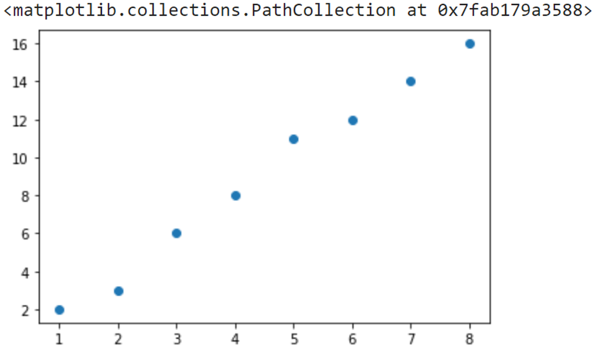
The default color is blue, for some lists attributeOne and attributeTwo, here's what my scatter plot looks like:
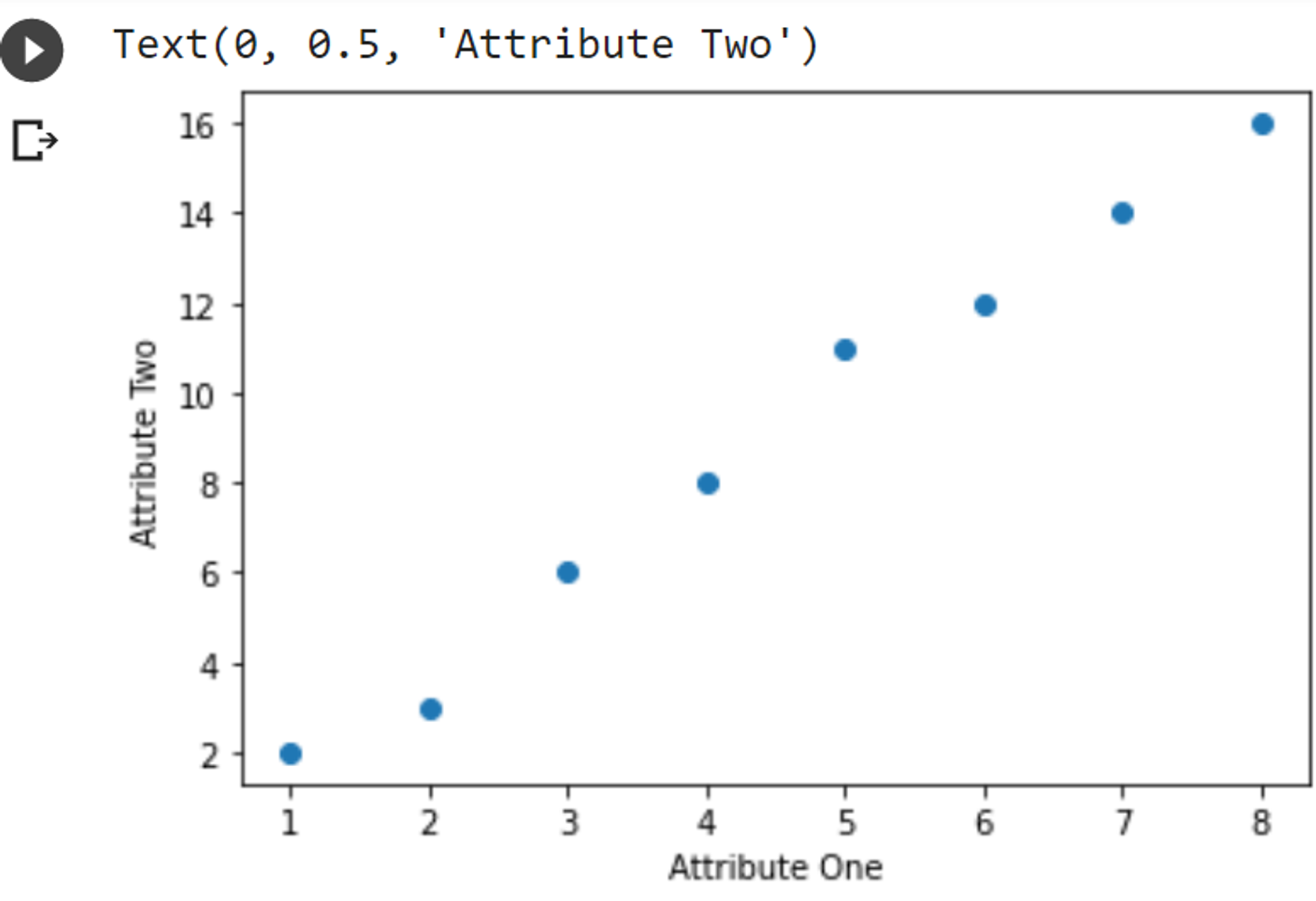
However, if you have ever done plots for science class, teachers always focus a lot on the labels for the axes. So let's add those in:
plt.scatter(attributeOne, attributeTwo)
plt.xlabel('Attribute One');
plt.ylabel('Attribute Two');
That produces this:
And that's all! Congratulations, you know how to make a scatter plot now!
Download the notebook and do the practice problems.
Copyright © 2021 Code 4 Tomorrow. All rights reserved.
The code in this course is licensed under the MIT License.
If you would like to use content from any of our courses, you must obtain our explicit written permission and provide credit. Please contact classes@code4tomorrow.org for inquiries.