3.7 FormsThe <form> ElementThe <input> ElementText FieldsInput Type Checkbox The <label> ElementThe <select> ElementThe <textarea> ElementRadio ButtonsThe Submit Button The value AttributeThe size AttributeThe maxlength AttributeThe placeholder Attribute
3.7 Forms
An HTML form is used to collect user input. The user input can then be sent to a server for processing.
The <form> Element
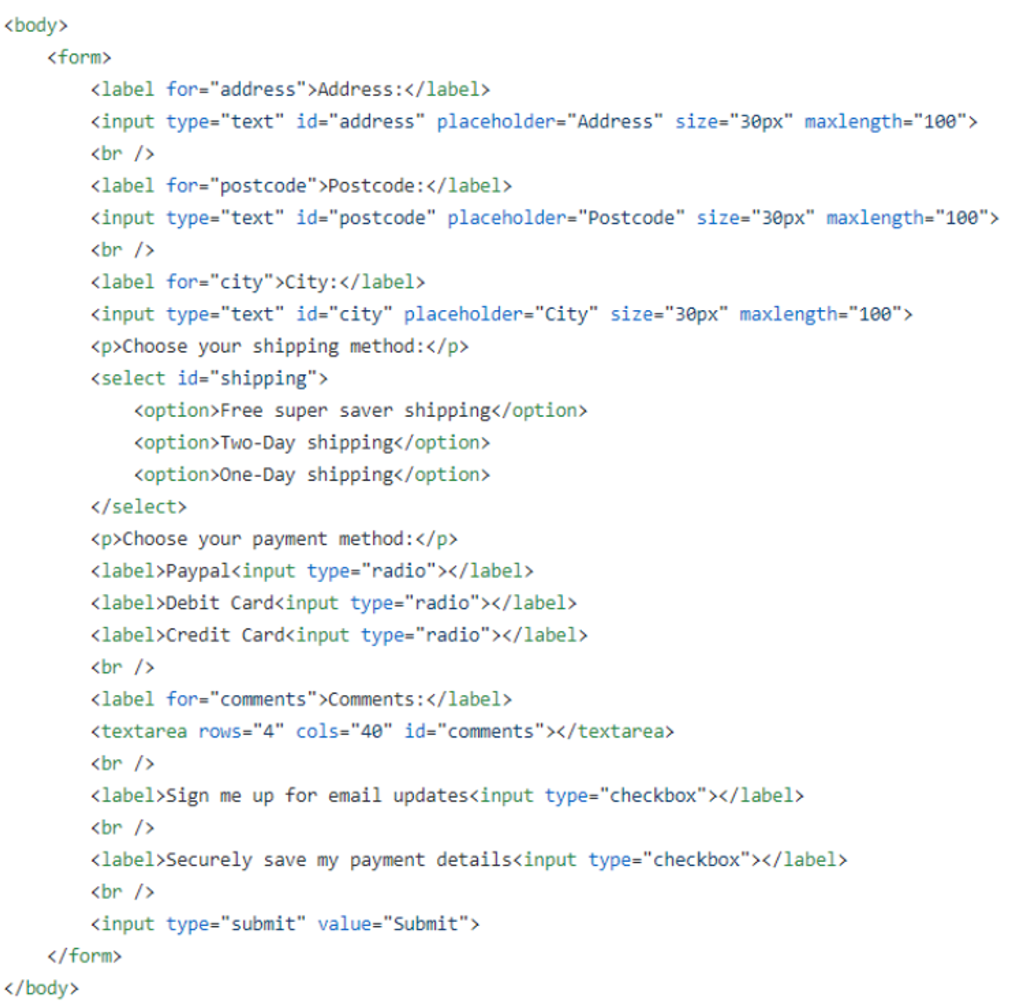
The HTML <form> element defines a form that is used o collect user input. An HTML form contains form elements. Form elements are different types of input elements, like text fields, checkboxes, radio buttons, submit buttons and more.
The <input> Element
The <input> element is the most important form element, The <input> element is displayed in several ways, depending on the type attribute.
Text Fields
<input type ="text"> defines a single-line input field for text input.
Note: The form itself is not visible. Also note that the default width of an input field is 20 characters.
Input Type Checkbox
<input type="checkbox"> defines a checkbox. Checkboxes let a user select Zero or More options of a limited number of choices.
The <label> Element
The <label> tag defines a label for many form elements. The<label> element is useful for screen-reader users because the screen-reader will read out loud the label when the user is focused on the input element.
The<label> element also help users who have difficulty clicking on very small regions(such as radio buttons or checkboxes) - because when the user clicks the text within the <label> element, it toggles the radio button/checkbox.
The for attribute of the <label> tag should be equal to the id attribute of the <input> element to bind them together.
The <select> Element
The<select> element defines a drop-down list.
The<option> elements define an option that can be selected. By default, the first item in the drop down list is selected. To define a pre-selected option, add the selected attribute to the option:
The <textarea> Element
The<textarea> element defines a multi-line input field( a text area). The rows attribute specifies the visible number of lines in a text area. The cols attribute specifies the visible width of a text area.
Radio Buttons
<input type ="radio"> defines a radio button. Radio buttons let a user select ONE of a limited number of choices.
The Submit Button
<input type ="submit"> defines a button for submitting the form data to a form-handler. The form-handler is typically a page on the server with a script for processing input data.
The value Attribute
The input value attribute specifies an initial value for an input field:
The size Attribute
The input size attribute specifies the visible width, in characters, of an input field. The default value for size is 20.
Note: The size attribute works with the following input types: text, search, tel, URL, email, and password.
The maxlength Attribute
The input maxlength attribute specifies the maximum numbers of characters allowed in an input field.
Note: When a maxlength is set, the input fields will not accept more than the specified number of characters. However, this attribute does not provide any feedback. So, if you want to alert the user you must write JavaScript code
The placeholder Attribute
The input placeholder attribute specifies short a hint that describes the expected value of an input field(a sample value or a short description of the expected format). The short hint is displayed in the input field before the user enters a value. The placeholder attribute works with the following input types: text, search, URL, tel, email, and password.

Previous Section
3.6 EntitiesNext Section
3.8 Images, Links, List, and Form PracticeCopyright © 2021 Code 4 Tomorrow. All rights reserved.
The code in this course is licensed under the MIT License.
If you would like to use content from any of our courses, you must obtain our explicit written permission and provide credit. Please contact classes@code4tomorrow.org for inquiries.
